Design
Design is ingrained into our company's culture and work process, so we'll be sharing ideas, thoughts and trends in this important aspect of developing great business strategies that lead to successful business practices.
When starting your business from the ground up you may already have any idea of what it is you want as a logo.
But you may not be sure on what color or typography you want to use.
You may just think it’s not as important when it definitely is.
So why is color so important?
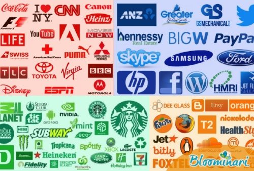
In a past blog, we talked about how different brands have their “special color” and how we react to them. Scientists have proven that color evokes an emotional reaction in us.
So how do you choose the color you want?
What do we want people to feel when they see our brand? Make sure you know the meaning of the color!
For example, green has to do with nature, life, renewal, freshness, money, banking and safety.

Many fast food chains use the color red because it’s a color that evokes hunger. It also gives you a feeling of energy and power but is also associated with passion, desire, and love.

Many politicians use blue on their logos because it symbolizes trust, loyalty, confidence, intelligence, faith and truth. It’s a color that produces a calming effect.
Orange is associated with joy, warmth, sunshine, balance, creativity, and health. It gives you a feeling of optimism and rejuvenation.
Not many people use this color for logos but if you want to evoke any of the above words maybe orange is your best bet.

Typography is also an important role when it comes to branding. Why? The brand is what identifies the product, service, person or place and gives it its unique personality.
Why does typography matter in your branding?
New York-based designer James Puckett had a great explanation: “I always tell people that the difference between good typography and [bad typography] is the difference between work that looks professional and works that looks like someone threw it together in MS Word. One reason Apple’s stores look so good is the careful and consistent application of [the typeface] Myriad. But Kmart’s careless mashup of Helvetica, Gill Sans, News Gothic, and Gotham looks like, well, Kmart.”
So what’s the difference between a serif and a san-serif type?
A serif type has a small decorative line added as an embellishment to the basic form of a character (a character is a letter or number). The most famous serif typeface is Times Roman. It’s a typeface characterized by its more traditional and elegant feel.

A san serif typeface is one without the end stroke. The most famous san serif is Arial. It’s easy to read when looked at from afar and has a clean look. It’s a typeface that has a more modern feel to it.

There’s a lot that goes on in a graphic designers mind when it comes to branding. It may seem like a simple task but everything has its own meaning, from color to what typography you are using.
Make sure you're evoking what you want your customer to feel when they see your brand.
As the old saying goes, you should never judge a book by its cover.
While this is an appropriate adage to live your personal life by, the reality is most businesses are in fact judged by their cover, and judged quite harshly at that.
And by a business’s cover, of course, I mean their website.
- Forty-eight percent (48%) of customers—essentially 1 out of every 2 people—use a company website as the #1 factor in determining a business’s credibility.
- Additionally, Ninety-four percent (94%) of customers said that dated, ugly, or confusing website design was the main reason they did not choose to go with a business.
Advertising agencies are self-contained structure. Within the advertising agency, there are departments and people, all essential to the movement of client projects and the overall success of the agency. One department cannot work without another, as they are all interconnected and dependent on each other.
Think of an ad agency as a chair. The agency as a whole, as an organization, is the seat. It’s the part of the chair people take most notice of; it’s where clients sit and relax. The departments are the legs, the support system. Like a chair, if one leg fails, the whole agency falls. In most agencies, these four legs, or departments:
Creative
Creative is responsible for creating the ads, from concept to final product. Within the creative department, there are designers and art directors, who are responsible for visual elements, and copywriter, who are responsible for coming up with wording. The accounts department creates a “creative brief”, or a document communicating the client’s project requests, which is then given to the creative department. The creatives then execute a concept, based on the creative brief, with several rounds of client revisions. Once the project exceeds clients’ expectations, the creative department packages the project in digital formats, which can be used for printing, TV broadcasting, digital advertising, and so on.
Accounts Department
The accounts department acts as the liaison between the agency and the client. If the client requests a change to a project, account executives are responsible for passing on the information to the creative department. For example, if the client requests a color revision on an ad, the account executive assigned to that client, will inform the designer of the requested change. Once the revisions have been made by the creative department, the account executive will deliver the revised project the client, until completion.
Branding is no easy feat.
There are an exponential number of elements to take into consideration: logo, typeface, messaging, strategy, purpose, value, audience, the list goes on. And while all of these items are essential to building a solid brand, one items reigns highest on the list. Color.
Why color? Color is the first thing our eyes see.
What is a Mood Board and why you should be using one
Written by Erik RosnerMaybe you’ve heard of a mood board. Maybe you haven’t.
It´s a fun tool used to gather artistic inspiration comes to mind when you are on the right track. If you picture some sort of hybrid weegie board, you might be a little further from the mark…
Whatever your impression of a mood board might be, it is something you should get to know and love. Making one can be quite fun all in its own, and designing/building/creating anything in a team without one can lead your projects down a serious path of misdirection.
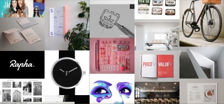
A mood board is an assortment of images, textures, colors, and fonts all arranged together and used to define the overall style or ‘mood’ of your project.
Why You Need One
If you create things for a living then I’m sure you already use cool stuff you’ve seen as an inspiration. A mood board is simply a more polished, cohesive collection of those cool things.
They are used all across the board (maybe pun intended). Creatives working in design, branding, photography, fashion, film, interior decorating and even wedding planning all use mood boards.
Be aware though, mood boards serve a broader purpose than pure inspiration.
If your work is for a client, then assembling a mood board together is how you let him or she get involved in the design process without them sticking a nose in trying to play art director.
It is how you guarantee that you are all on the ‘same page’ with the direction of the project.
You know that feeling in the pit of your stomach when you present a beautifully-designed piece of work only to have it unapologetically rejected because it didn’t have the right ‘feel’. Agreeing ahead of time on the elements in the mood board and having your client contribute images they like is how you all are in agreement of what that ‘feel’ should be.
How To Make One
There really isn’t a definitive structure for making a ‘correct’ mood board.
Usually, the elements are arranged in some sort of fashion collage. Whether they are strictly aligned to a grid or more loosely placed is dependent on your own style.
Less Is More: Why Taking Away From Your Design Adds More Value
Written by Erik RosnerBeginner designers too often feel the need to overdo their designs attempting to make them look artistic or elaborate.
We have all heard the expression “less is more”. Usually, this is said to mean ‘cheaper is better’. In truth, however, “less is more” isn’t about spending less money.
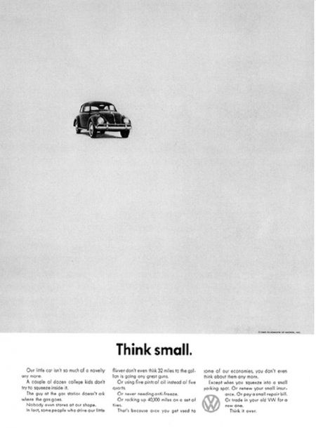
It is about achieving better design through simplicity. It is about finding the greatest impact through subtraction and restraint.
Newborn creatives try and mask their infancy with flashy graphics and elaborate typefaces. I too, was guilty of this when first starting out.
All this really does, unfortunately, is overcrowd and overcomplicate the piece. Just because a design is simple doesn’t mean its basic or uncomplex. '
Having too many elements in design gives the viewer too much to digest and takes away from the other elements in the piece and the design as a whole.
20 Un-ignorable Rules of Graphic Design - Part 2
Written by Erik RosnerRecently we unveiled for you part 1 of our feature 20 Unignorable Rules of Graphic Design adopted from Timothy Samara’s Visual Elements: A Graphic Style Manual. If you missed it you can find it here.
In this second half of the article, I will break down for you ten more unignorable rules that constitute graphic design.
As always remember that these rules aren’t set to never be broken no matter what. Rather, when you do choose to break them do so with a specific intent in mind to better convey your message.
On that note, happy designing and let’s get started!
11. Be Universal; It’s Not Just About You
Artists often create for themselves, but as a designer, you create for everyone else. Your audience must know what it is you are trying to say with those shapes and lines and colors, not just a few ‘enlightened’ folks. Your designs are ultimately being used to promote a concert or relay instructions in a manual or something else communicative. While you should most definitely leave your own creative mark on every piece of work, you will be ultimately judged by how effectively you convey the message, not how pretty your piece looks.
12. Squish and Separate
If it’s your intention to make your piece look dull and lifeless, then, by all means, align everything with equal proportions using the same color, shape, and typeface. On the chance, you want to give it some actual life (which hint, hint you should always be doing), move things around and squish some elements together. Give the viewer’s eyes some curves to follow by creating a flowing piece ramp with contrast and density.
A person’s impression of what’s ‘good’ or ‘bad’ design generally is picked up through education and experience. Accumulated from the multitude of designers and critics who came before them, most criteria inevitably boil down to personal preference.
Some are aesthetically based, like “asymmetry is more beautiful than symmetry,” or “a neutral typeface is all you need.” Other factors are more functional, such as “never reversing a serif typeface on a solid background if it’s less than 10 points.”
All rules are meant to be broken, but they should never be completely ignored. This set is not intended to be a definitive checklist to making good design. It should, however, provide points to be considered in every creative project you take on.
Adapted from Timothy Samara’s Design Elements: A Graphic Style Manual, here are
20 unignorable rules of graphic design
1. Have A Concept
Every, every, every design you ever make must have a meaning behind it. Plain and Simple. It doesn’t matter how beautiful your art is or how creative your graphics look. If your design doesn’t contain a story, an idea or a message you are trying to convey, it isn’t graphic design. It’s just pretty pictures on a page. Tell us something with your work.
2. Communicate, Don’t Decorate
Form carries meaning. No matter how simple or abstract that form may be, a form that doesn’t match up communicates conflicting messages to your audience. Experiment with different shapes, details, colors and effects, and explore how they all can work together to support your message. Without keeping your message in mind, your work runs the risk of simply becoming a collage of graphics no longer qualifying as communicative design. Everything the viewer sees should be there for a reason.

