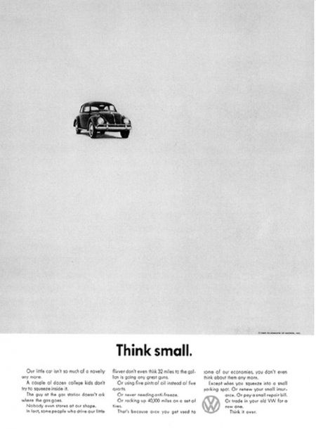
In my own work, I tend to lean towards the minimal. I like my objects to have some breathing room so to be better appreciated. I like my open spaces to have as much impact as the stuff that fills them. The real art is to create spaces within your work that are open but not empty.
Before you get to work designing, it is crucial to first have a clear purpose or message behind your design. Defining the purpose early on helps you to stay on track and select only elements that most illustrate your message.
When adding something new, ask yourself:
- Is this really needed or am I just filling up space?
- Will this be distracting from my work’s message?
Anything you add that does not directly enhance to your message can be a distraction. Remember, effective design is visual communication. What message are the elements in your work communicating?
Once your message is clear, choose a single high-quality or stand-out image and let it, well, stand out.
A single bright red object on a monochromatic gray color scheme, for example, is way more impactful on its own. Adding another object the same color red would dilute the effect, not add to it.
Choose additional complimentary objects, graphics or typefaces that are simple or pure in design. They won’t be boring. In fact, they will compliment the other objects tying the whole piece together beautifully.
In this stage taking hierarchy into consideration is extra important.
Since there are less objects on your page each element gets extra attention. In general, you only have a few seconds to convey your message to the viewer before he or she has moved on to the next thing. The way you use different sizes and weights creates a path that leads the viewer through the page confidently so they are confident they’re heading in the right direction.
I do not mean to scare you, but every detail has major significance and what you remove from your work is just as important as what you add. With clean, simple designs, your mistakes are magnified. When placing or arranging objects be sure to follow sound fundamentals of grids and layouts.
All this takes practice, but don’t let my warnings scare you. It can be very fulfilling to see improvements in design aesthetics through subtraction. Even if you aren’t going for a minimalist look in your next piece, ask yourself what is essential to the message you are trying to convey and what could possibly be removed to enhance that message even further.
Happy designing!


